Top Tips to Design Engaging Twitter Banners That Boost Your Brand
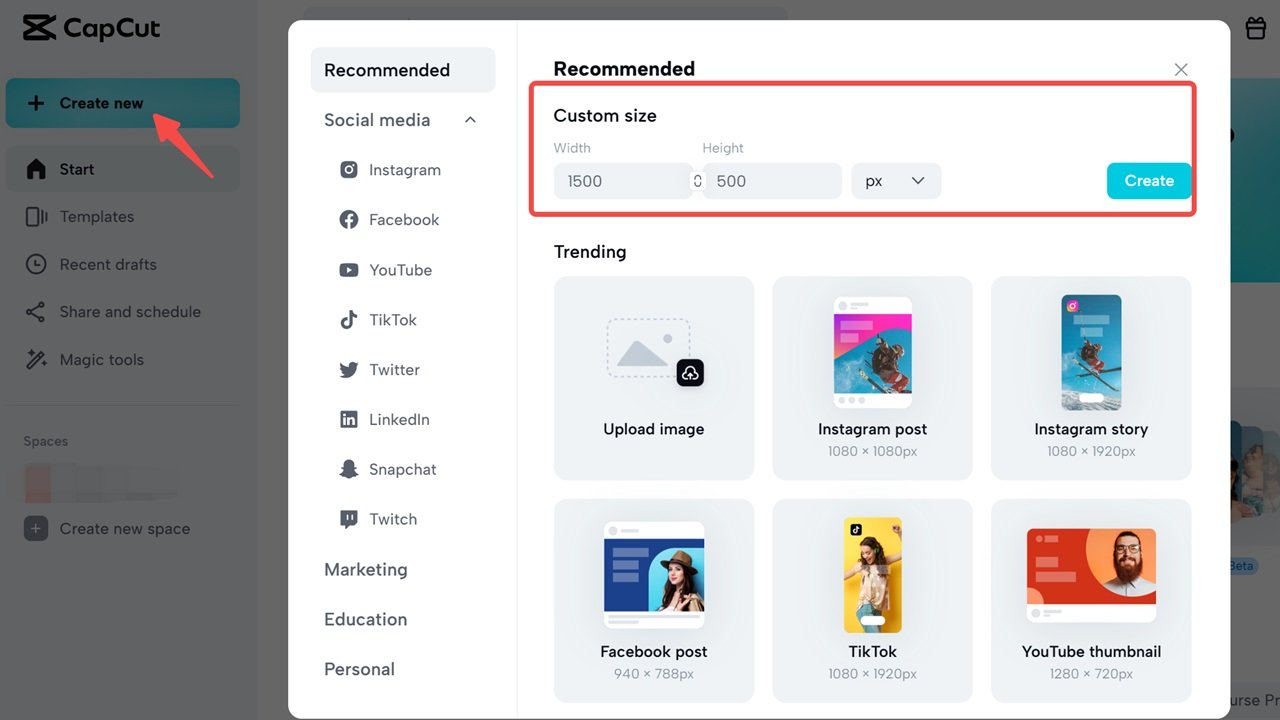
A banner on Twitter is one of the first things that catches the attention of a visitor on a particular profile. It is not just a pretty picture—it is a digital sign that has something to say about the brand. Twitter banners are known to play a great role in determining how well the brand will be accepted by the audience as well as its reception. Some of the twitter banner maker such as CapCut Commerce Pro that have simple templates and designs have helped in the creation of visuals that are in line with the brand. A good banner will attract the attention of the onlooker and make a lasting impression on him.
Start with a Clear Message
A Twitter banner should be clear and convey the message of the brand. Regardless of whether it is a product, an event, or a tagline, the design should revolve around one concept. Cluttering of designs or even information can be misleading. Simplicity is key. A banner should give a fast glimpse of the brand image and people should be able to know what the brand is all about. For instance, an e-commerce firm may use its homepage to present the most selling product while a non-profit organization may post a picture of the needy individuals it supports. It is crucial to always keep our eyes on what makes the brand stand out and recognizable.
Use High-Quality Images
The core of any banner is visuals. Pixelated images, images of low quality may greatly affect the reputation of the brand and can give the company a bad façade on the social networking site. The use of high-quality images makes the banner clear and attractive to the users of the different devices. The image choice should be in harmony with the brand’s style. A tech company will incorporate sharp and shiny images while a travel agency will incorporate beautiful scenes. The aim is to select images that are aesthetically appealing while being meaningful to the intended brand narrative.
Balance Colors and Fonts
The use of color and font is very important in coming up with a good banner. The colors should also be in contact with the brand colors for a lot of reasons such as uniformity. The vivid or warm colors are more eye-catching because people feel that the product is easier to approach, while the pastel colors with subtle hues in some way offer more sophisticated or relaxing impressions. Different font types and sizes should be used and made easy to read and should be in harmony with the mood of the whole design. Most banners look good with clean and modern fonts. If text is included, it should be large enough to be read on a desktop and a mobile device at the same time. Text and imagery are not dominant over each other so that one does not overpower the other.
Conclusion
A good Twitter banner is a powerful way to make a first impression and help a brand stand out. When the message is clear, the visuals are good, the design is balanced, and the branding is correct, a banner becomes a tool for connection and business development. Tools like CapCut Commerce Pro make design much easier, allowing brands to focus on the narrative. Brands should therefore dedicate time and effort to creating an attractive Twitter banner that will grab attention, establish credibility, and increase the brand’s visibility on the platform.


